Best known for creating the mega iconic Apple logo that we all know and love, leveraging Rob Janoff's 40+ years of experience working with Fortune 500 brands, Hilton Hilton has the capacity to successfully communicate a global visual brand language.
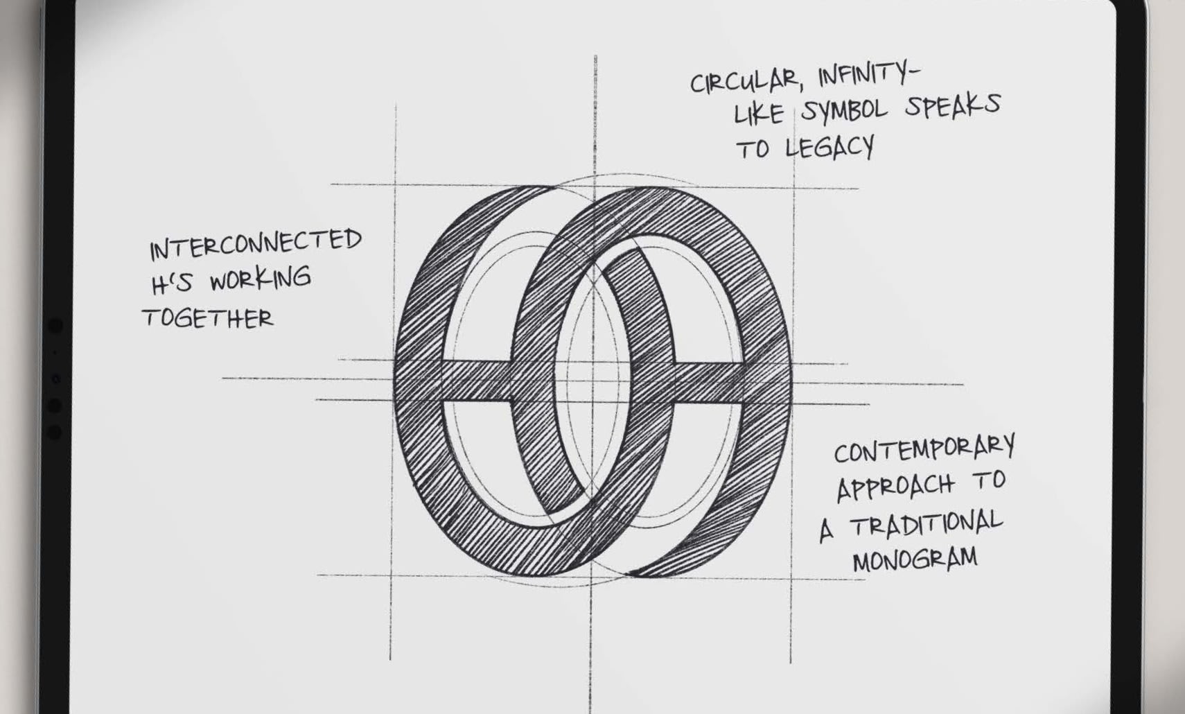
This mark, by nature, feels like it is in motion. The circular, interconnected shapes generate movement that resemble an infinity-type shape. This concept connects well with the legacy brand trait and the two H’s representing the current and future.
Monograms carry a classic sensibility often seen in country clubs and associations of an exclusive nature. Therefore, a goal in concept development was to merge the past with the future.
The structural dimension of this mark aligns well with the idea of rings which are a sign of eternity. The exclusive feeling of the brand is revealed through a shape of powerful meaning.
Having a duality of Hilton owners demanded that our new logo speak to the power created by combined energies and expertise. The discovery phase of our design work naturally focused on the desirability of circular shapes. The connection to a more feminine form as well as the dynamism achieved with intertwined elements enabled a compelling brand story to emerge.
Although a selection of competing designs was presented, the chosen logo seemed to embody the perfect evolution of form. Unity and energy had powered the success of Rick and Barron Hilton’s relationship along with their success. Unity and energy, tradition and modernity, knowledge and technology. The new logo demonstrates the power of partnership.